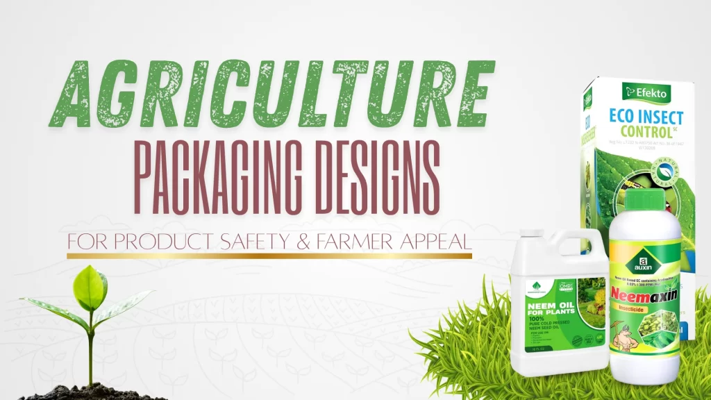
51+ Agriculture Packaging Designs for Product Safety & Farmer Appeal
Table of Contents
ToggleAgricultural packaging designs have evolved far beyond being just a protective layer. Today, it’s a storyteller, reflecting the land, the product, and the people who use it. Design in agriculture is a bridge between modern branding and traditional farming wisdom. Whether it’s the earthy tones of a rice sack or the illustrated sowing guide on a seed pouch, every design element carries meaning.
A well-thought-out design communicates trust and respect for the farmer’s world, making it the true language of agriculture branding, not flashy marketing. Consequently, a strong identity relies on consistency to communicate reliability. Therefore, implement a clear visual system using consistent colors and fonts across all product lines for instant recognition. Finally, focus on storytelling through design, highlighting the brand’s roots or featuring actual farmers, as this authenticity builds the essential connection and lasting trust.
Farmers don’t want design for design’s sake. They want packaging that feels honest, useful, and relevant. A good agricultural packaging design doesn’t try to impress; it tries to help. It tells the farmer: this product gets you.
Why Good Design Matters in Farm Packaging
Design is not about aesthetics alone; it’s about problem-solving. In agriculture, design plays a vital role because it connects industrial production to the people who feed the world. The right design ensures that products are not only functional but also intuitive, safe, and trusted.
When a farmer looks at packaging, they’re asking silent questions:
- Can I store this easily?
- Is it safe for my crops or animals?
- Can I understand the instructions without having to guess?
Does it appear to be a brand that stands behind its word?
Thoughtful design is the true language of agriculture, earning trust and respect; conversely, poor design undermines reliability. Therefore, build brand identity through visual consistency (colors, fonts) for instant recognition. Furthermore, focus on storytelling, since authenticity ultimately builds lasting connection.
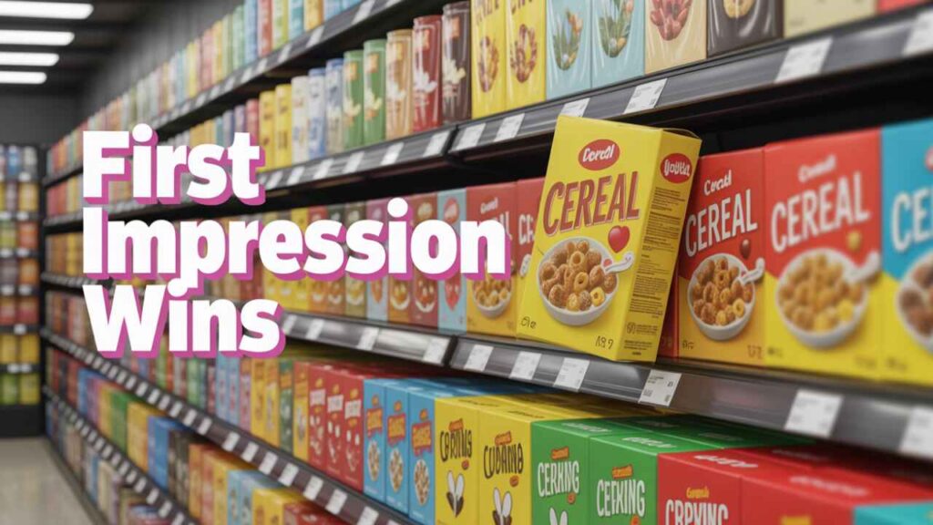
Modern agriculture also operates in competitive markets. Farmers compare products, brands, and even the durability of bags. Great packaging design isn’t just a marketing tool; it’s a silent salesperson that builds recognition and loyalty.
What Makes an Agricultural Design Speak to Farmers
Good lives at the intersection of utility and emotional connection. To truly resonate with farmers, it should embody three key traits: simplicity, familiarity, and trustworthiness.
Simplicity and Functionality
Farmers work in demanding environments. They need packaging that’s easy to handle, store, and read. Clean layouts, large fonts, and minimal clutter make information accessible at a glance. A great design respects time and usability over flashiness.
Visual Familiarity and Rural Relevance
Designs that mirror rural aesthetics; natural colors, earthy textures, and regional motifs; instantly connect. For example, a paddy seed brand using illustrations of local landscapes creates an immediate bond with rice growers.
Trustworthy Color Palettes and Typography
Colors and fonts can subtly influence perception. Deep greens and blues suggest reliability, while too many bright or artificial colors can feel insincere. Bold, readable typography shows confidence; cursive fonts might feel out of place in the field. Every choice should serve a purpose.
From Seed Bags to Fertilizer Sacks: Design Beyond Function
Agricultural packaging design comes in many forms, but all share a common need. a balance between durability and design clarity. Let’s take a closer look at different categories:
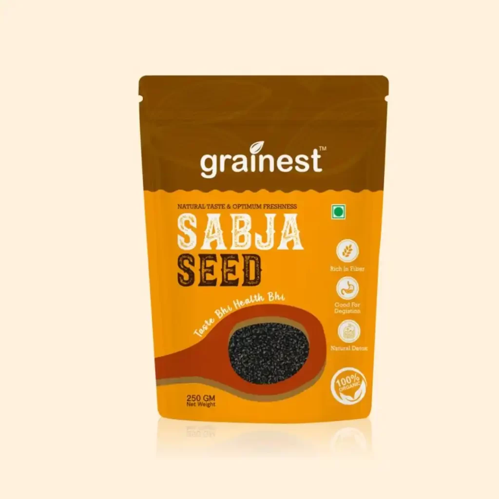
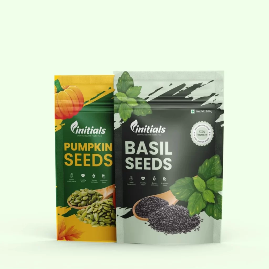
- Seed Packaging: Often bright and informational, seed designs focus on germination rates, crop images, and growth promises. Using icons for crop types or harvest time simplifies identification.
- Fertilizer Packaging: Must convey technical data clearly while maintaining a trustworthy visual appeal. Too much clutter can confuse; a minimal design with color-coded sections works best.
- Pesticide and Agrochemical Packaging: Safety is key here. Use contrasting colors for warnings, simple infographics for dosage, and tamper-evident seals to reinforce trust.
- Animal Feed Bags: Often vibrant, with illustrations of healthy animals. Designs that include feeding instructions or storage tips right on the bag add extra value.
- Produce and Grain Bags: For consumer-facing farm produce, storytelling through visuals matters. A rustic design with farm imagery builds authenticity.
Every category offers space for creativity; the goal is always communication, not decoration.
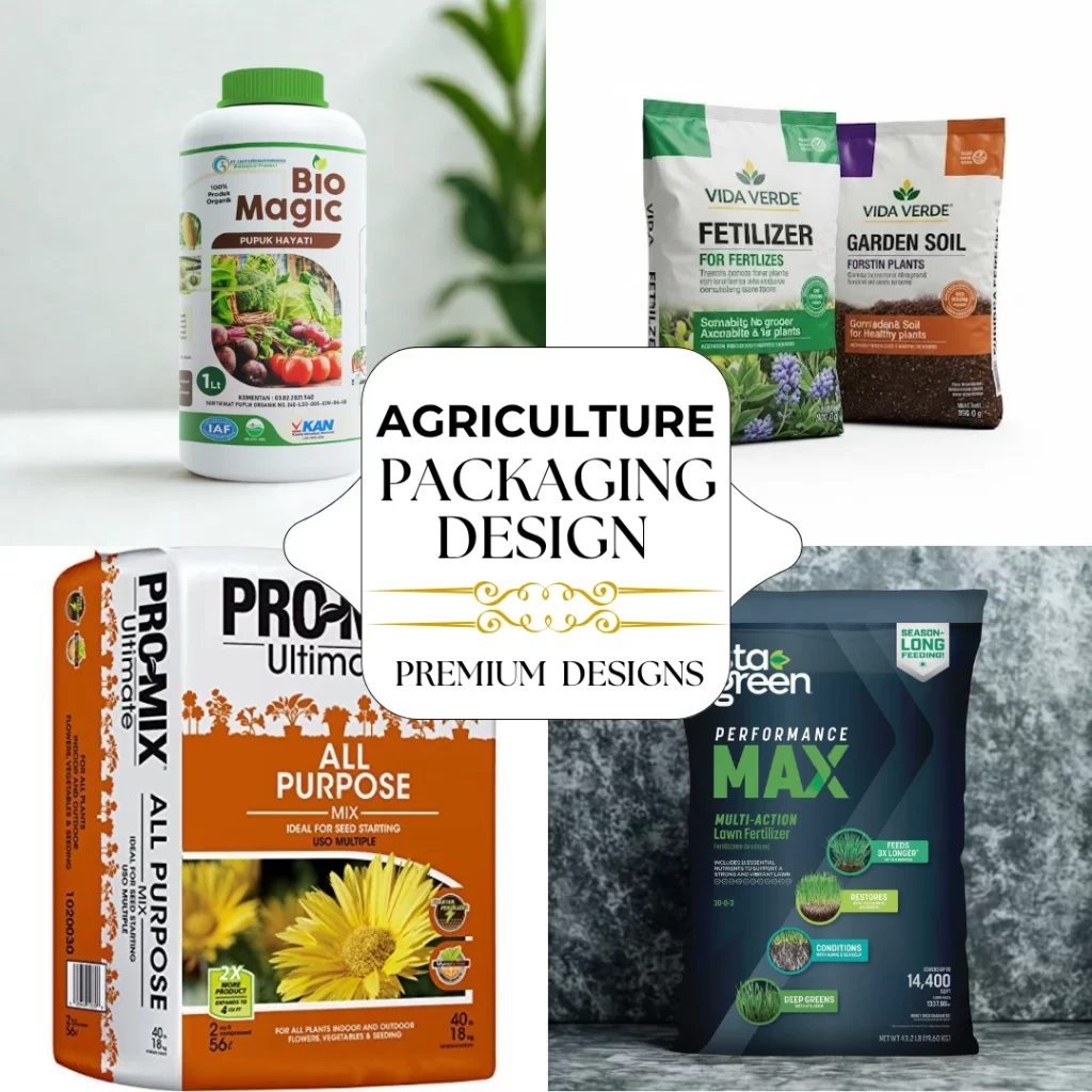
51+ Agriculture Packaging Design Ideas that Inspire
Here’s where inspiration meets practicality. Below are over 51 real-world design ideas and directions that blend creativity with utility, each showing how design can speak the language of farmers.
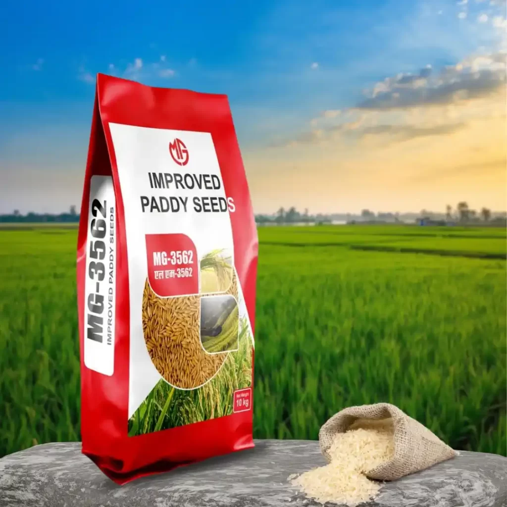
Seed Packaging Designs
The redesigned seed packaging design prioritizes visual clarity and practicality. Features include transparent windows to check quality, color-coding for quick crop identification, and pictorial guides for sowing and growth. The packaging utilizes resealable, biodegradable, and moisture-resistant bags, incorporating icons for soil and weather compatibility
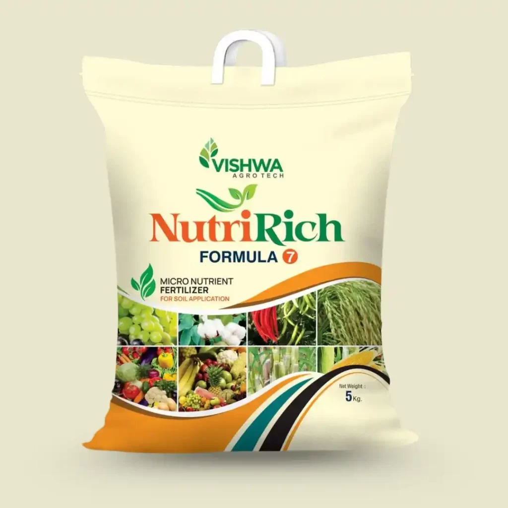
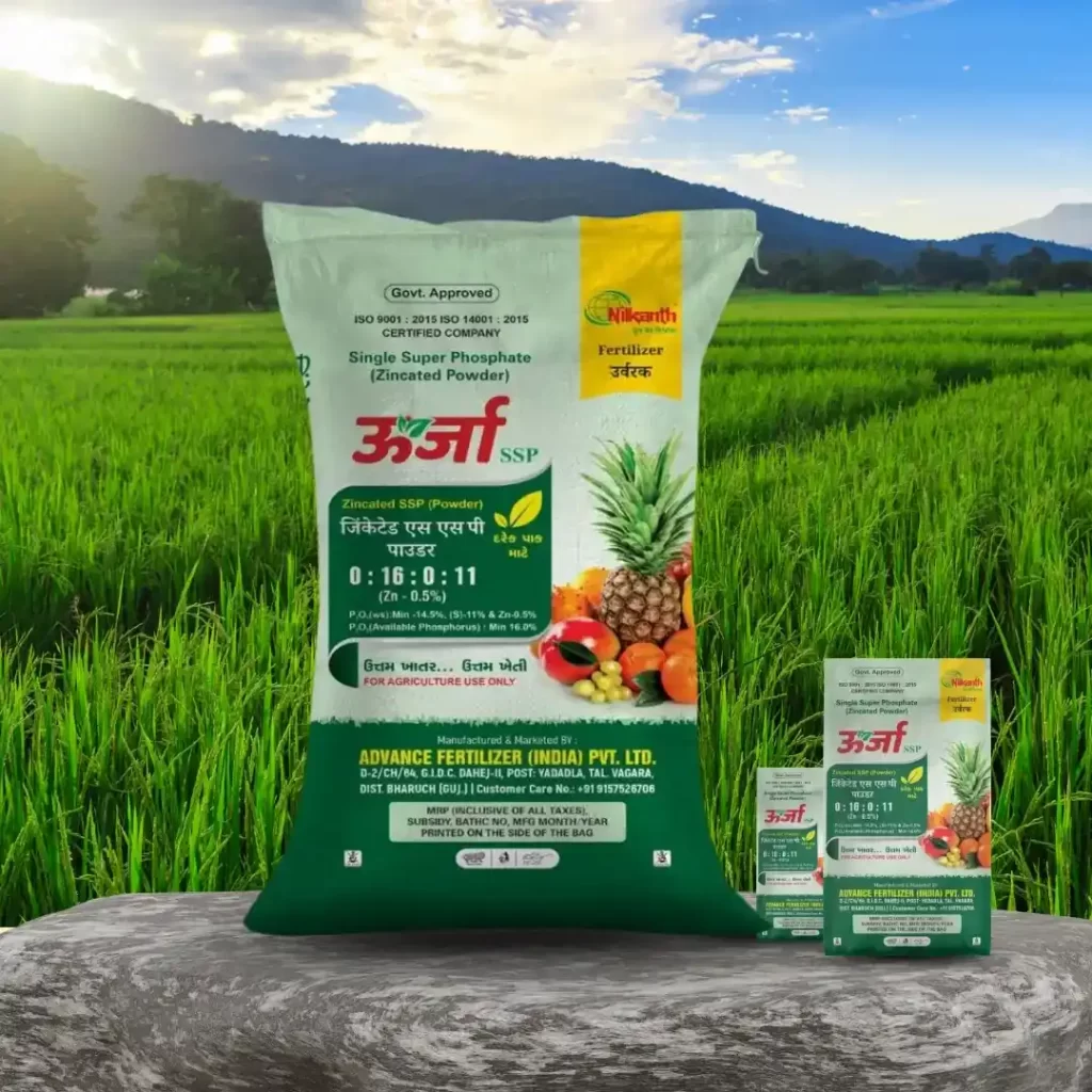
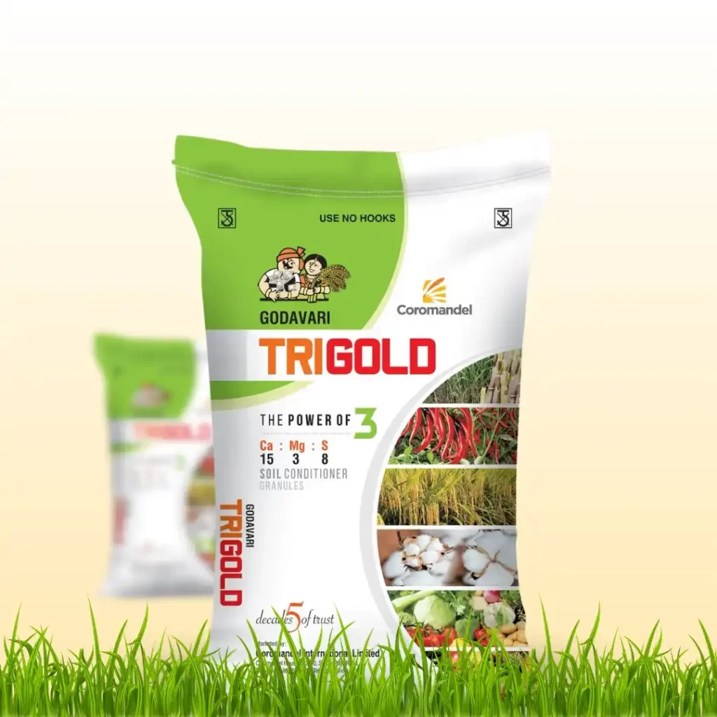
Fertilizer Packaging Ideas
The new fertilizer packaging adopts a minimalist, clean grid layout to clearly display NPK ratios and application rates. Text instructions are replaced by simple icons, and essential details are highlighted against white backgrounds. Bold color bands allow for quick identification of nutrient types. The design includes regional soil illustrations for localized identity, integrated handles on large bags for ease of lifting, and QR codes linking to usage videos in local languages.
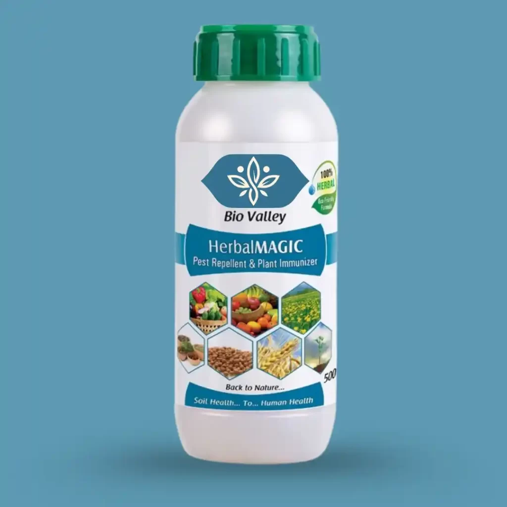
Pesticide and Agrochemical Visuals
This chemical packaging is designed for safety and usability. It features high-contrast labels for hazard warning, ergonomic, leak-proof bottles with secure grips, and tamper-proof caps. Icons replace text for dosage/dilution, and textured labeling aids identification by touch.
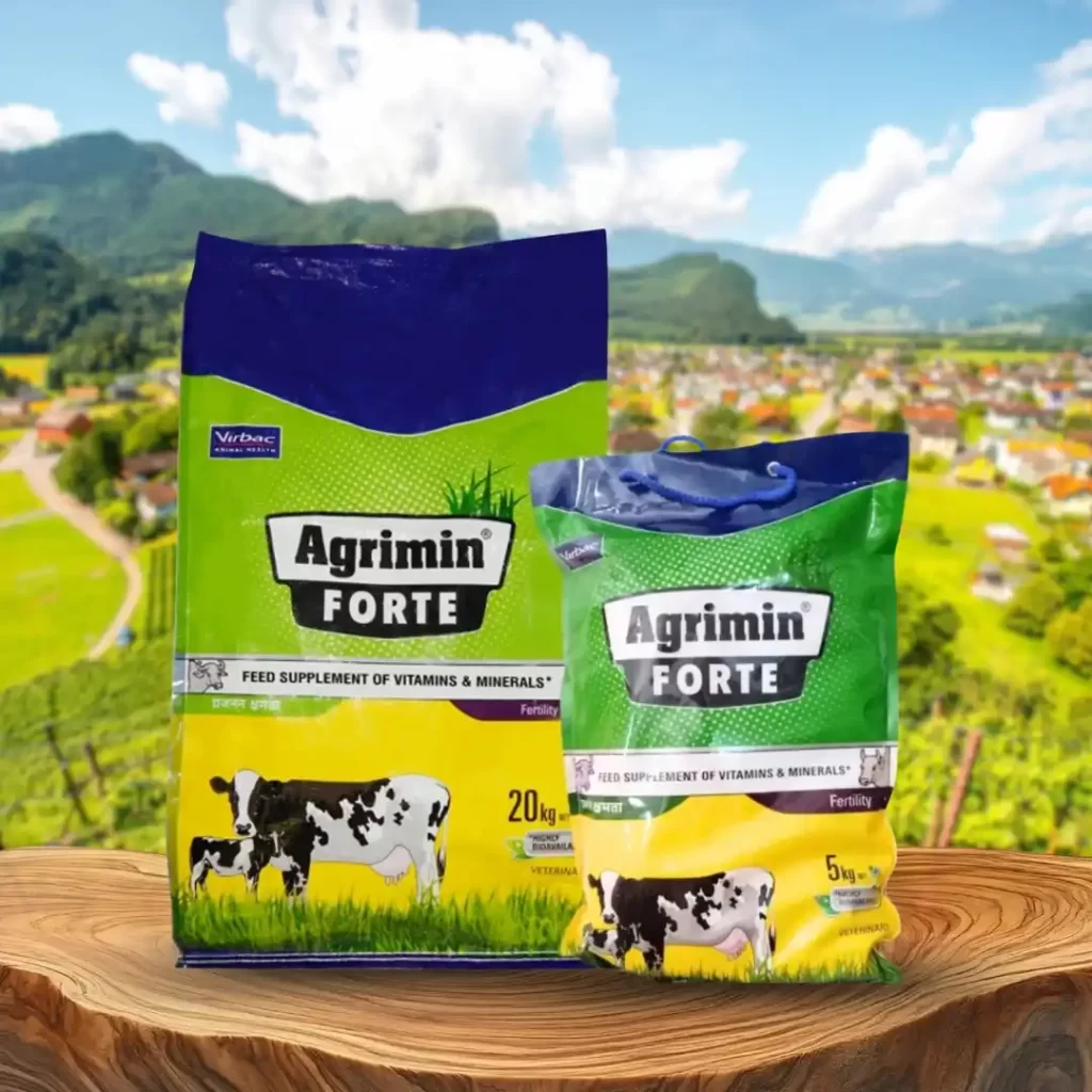
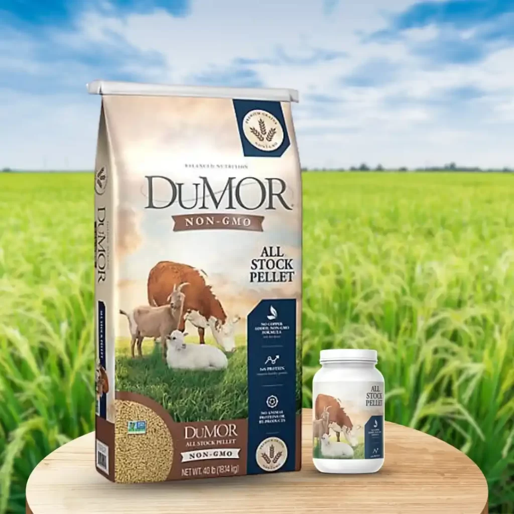
Animal Feed Packaging Styles
Animal feed packaging uses vibrant illustrations and bold logos for brand recall. It features large nutritional charts and slogan-based branding. Natural kraft textures signal organic quality, and the bags are reusable woven material for farm storage.
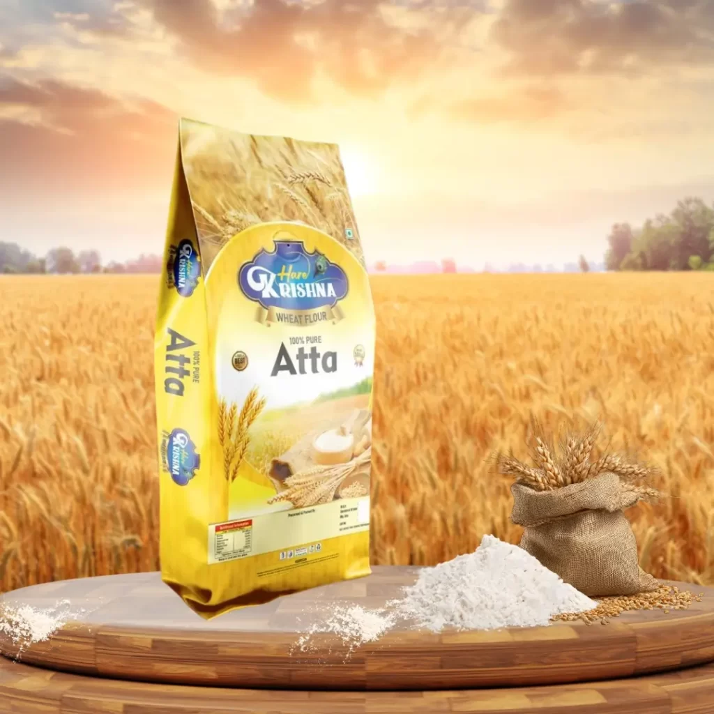
Produce and Grain Bags
Produce packaging highlights authenticity and freshness using rustic illustrations and farmer names/coordinates. Transparent sections show quality, and minimal logos keep the focus on the product. It uses breathable jute/mesh bags and embossed textures for a premium feel.
Regional and Cultural Packaging Themes
This cultural packaging features ethnic art and traditional motifs (sun, soil) reflecting local identity. It includes multilingual text and uses colors aligned with local beliefs. Designs draw inspiration from harvest festivals, and weather-resistant inks ensure durability in challenging climates.
General Creative Design Ideas
This advanced packaging blends engagement and function. It uses storytelling panels and region-specific patterns for connection, and infographics/pictograms for clear safety instructions. Key features include AR integration for demos, reflective ink for visibility, stackable designs, rounded corners, and waterproof, dual-layer construction with color-coded series for durability and recognition..
These examples show that agricultural packaging doesn’t need to be boring. Functionality and beauty can coexist when the designer understands the farmer’s mindset.
How to Build a Brand Identity for Agricultural Products
A strong brand identity in agriculture doesn’t rely on flashy marketing; instead, it’s built on a consistent, trustworthy design that communicates reliability and respect for the land. Farmers remember brands not because of clever taglines, but rather because of how those brands make their daily work easier.
Therefore, start by implementing a clear visual system, using consistent colors, icons, and fonts across all product lines so that your products are instantly recognizable on crowded shelves. In addition, focus on storytelling through design to highlight the brand’s roots, show ingredient sourcing, or feature actual farmers on the packaging, as this authenticity ultimately builds a deeper connection and trust.
Conclusion: Designing for People Who Grow Our Food
Agricultural packaging design isn’t about impressing art critics, it’s about serving the backbone of our food system. The farmer’s world is tough, practical, and grounded in reality. Design that understands this world earns respect.
When a farmer picks up a bag and feels that it’s strong, easy to read, and built for the field, that’s good design. When the colors feel familiar, when the label speaks clearly, and when the material lasts through the season, that’s design that works.
Farmers may not use design jargon, but they recognize value instantly. The best agricultural packaging speaks their language through durability, simplicity, and authenticity. In the end, design isn’t just decoration; it’s communication, respect, and partnership with those who feed the world.
Tags: