Artexpress is your go-to Packaging Design Company in India. As a leading Packaging Design Agency, we create unforgettable Product Packaging Design and Logo Design Services that connect and inspire.
Get your brand noticed with India's Best Packaging Design Agency.
Looking for a packaging design agency that truly gets your vision? Artexpress is your answer. We’re Leading a company with a passion for crafting visually striking designs. We specialize in building robust brand identity and compelling creative communication that makes an impact
Searching for a reliable logo design company? Artexpress provides expert branding and graphic design to create a strong, unforgettable identity for your business. We’re here to elevate your company with our outstanding design services.
See how Artexpress makes packaging Design special: it's our unique touch.
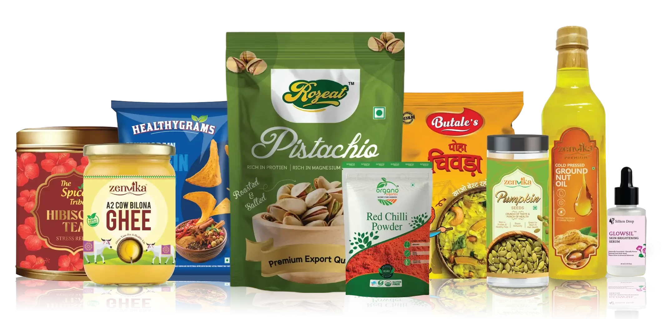
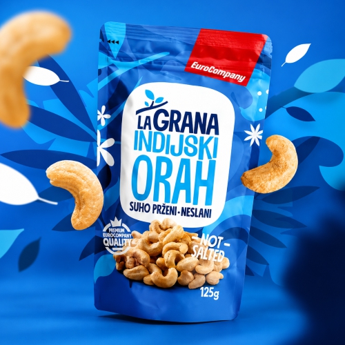
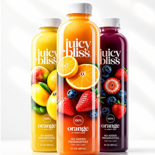
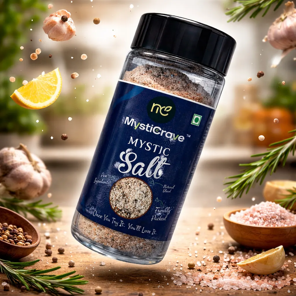
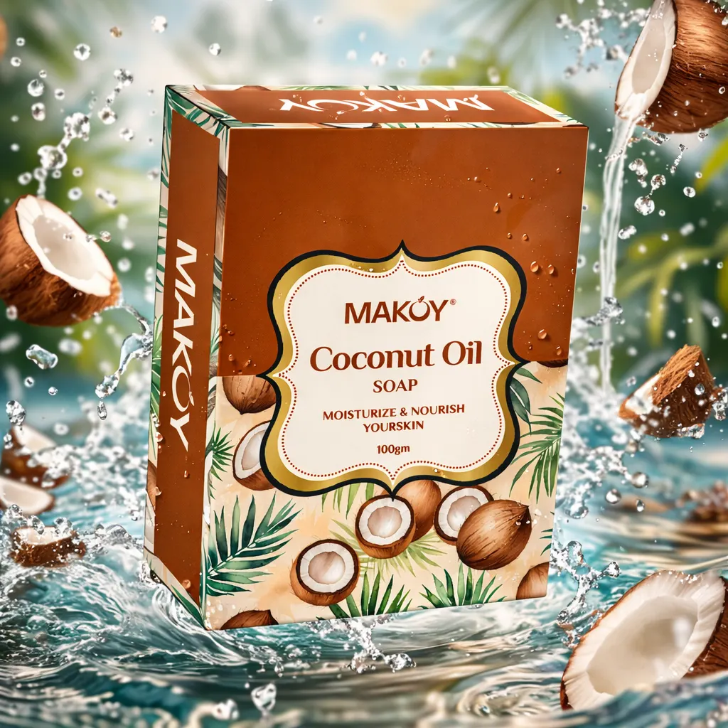
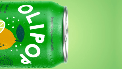
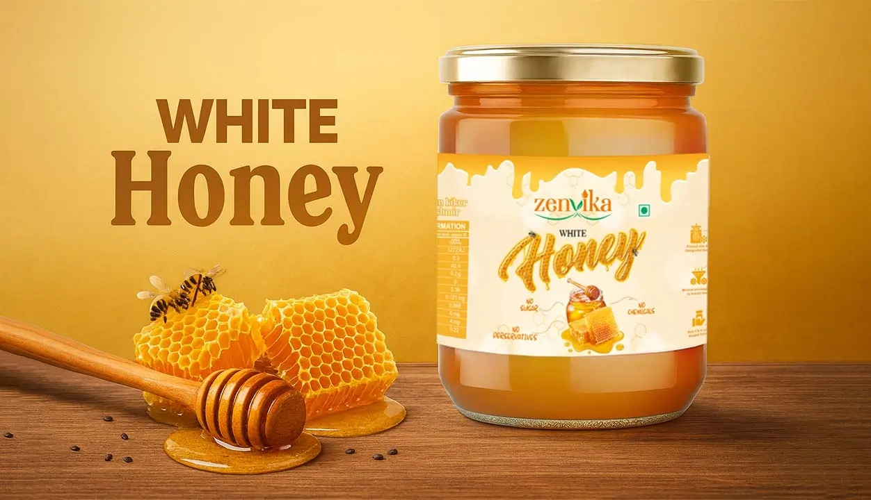
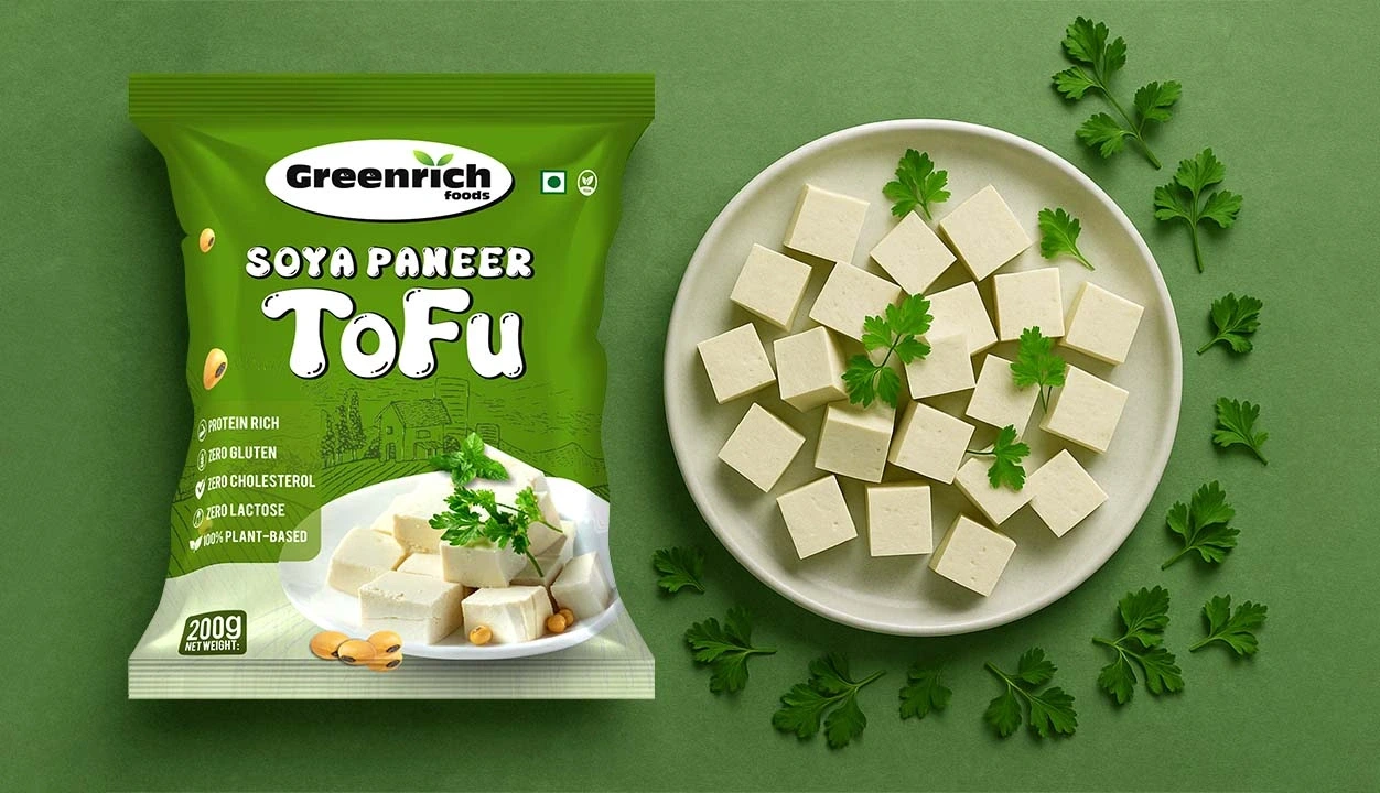
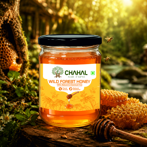
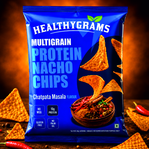
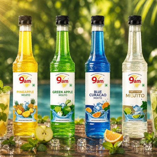
Want your brand to really stand out? . We make clever packaging Design that helps your products get seen, attract more customers, and boost your sales. See how powerful branding can change your business today!
We start by immersing ourselves in your business to understand your requirements and objectives fully. Our thorough evaluation process ensures we grasp the essence of your brand and the unique challenges you face.
02
Strategy
We craft a comprehensive strategy to elevate your business and build a standout brand. Our strategic planning focuses on aligning your vision with actionable steps that drive growth and resonate with your target audienc
03
Designing
Our dedicated team brings your vision to life with a commitment to staying ahead of trends and maintaining top-notch quality. We value your feedback throughout the design process to ensure our solutions meet your expectations and enhance your brand’s impact.
04
Delivery
We deliver exceptional results on time, meeting all your requirements with precision. Customer satisfaction is our top priority, and we strive to exceed your expectations with our compelling creativity and exceptional strat
Let’s Work Together!
Partner with Artexpress, the #1 Packaging Design Company in India
We love helping businesses build strong, lasting brands. Our dedicated team specializes in branding design, crafting creative Product Packaging Design, excellent Logo Design Services, and expert FMCG Packaging Design to make a real impact.
Great Brand start with Meaningful Discussion, Connect Us Now!
What our Clients says
Welcome to our precious box – every customer is precious to us – it’s only their trust and cooperation that make us who we are now. You can see a huge list from the top-listed ones to new birds. We created every brand uniquely and gave them a new identity in the market